This week's column is unique and calls for a different kind of introduction. What you are about to read is the tortured rants of a man who comes up with an idea for an article and follows through on it despite the great damage is causes to his psyche along the way. As you read on you will discover why this column was very nearly the last thing that Nick ever wrote.
He's called it the 5 minute Major... but as the Editor and therefore referee of this minor league hockey blog, and since I never asked him to write this, I'm giving it the extra two minutes for the instigator penalty and assessing a mandatory game misconduct. Strap in, this is a special... special column. Take it away Nick...
I’m sorry for this. I really truly am.
It is with absolute zero pleasure that I must assess my very first 5 minute major to NHL mascots due the fact that most of them seem to have been designed by the citizens of Guam. It has to be Guam! They have no hockey there! What other excuse could there be for choosing a pig as your representative when the name of your team is the Hurricanes? Only a citizen of Guam could think that a pig represents a hurricane.
The following is a list of every mascot in the league in order from bad to worse to what the hell is that thing?(Montreal) So put on your laughing hat and go grab a beer. I had to use an excel spreadsheet for this. It’s gonna be a long one.
Before I get started I want to clarify my ratings system. The 2 categories are Coolness and WTF Factor. Both categories are rated on a scale of 1 to 5. The actual score is the Coolness score minus the WTF score. I’m doing it this way to ensure that some teams receive the negative score they deserve.
One last thing before we do this: make sure you have this link pulled up in a separate tab while you read this post. You need to see some of these things for yourself as you go down the list.
http://i135.photobucket.com/albums/q124/cdnuniguy/Mascots/mascots.jpg
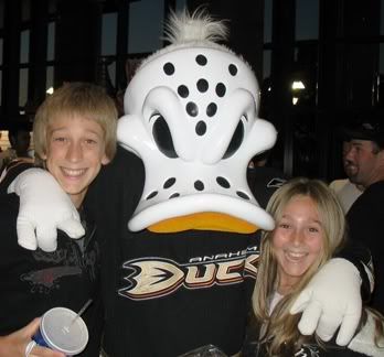
Wildwing representing the Anaheim Ducks
Coolness: 5
WTF Factor: 0
Mugshot: http://i49.photobucket.com/albums/f272/Kelly_K5/WildWing.jpg
Perfect score. Wildwing is both badass looking and 100% accurate in representing his team. He looks mean as opposed to happy and cuddly, which is a good thing. He’s almost too good and putting him on this list weakens my argument that all mascots are stupid. But I haven’t gotten anywhere near Pittsburgh yet so just be patient.
FACT: The Ducks have a statue of Wildwing outside the Honda Center making him the only mascot in the NHL to be immortalized in a statue. If I could deduct points for this, I would.
Thrash representing The Atlanta Thrashers
Coolness: 5
WTF Factor: 0
Mugshot: http://www.enchanter.net/florida/day13/thrash2.jpg
Another perfect score. He looks like the perfect pest which is what a mascot should be. He looks totally pissed, and represents the team perfectly. The Thrashers logo looks like some kind of… pissed off… hockey bird… with a stick… thing. Turn that into a mascot and you get Thrash. I can’t question the accuracy unless I find out that a thrasher is really a sea urchin or something. Then change the WTF Factor score to a 5 making the final score an even 0. As it stands now, it’s a perfect 5. Just a quick note: This is it for the perfect 5’s. It’s all downhill from here.
FACT: The Thrasher is the state bird of Georgia so we can forget all that “Sea urchin” talk.
FACT: It would help if I looked up the FACTS before writing about the mascot.
Gnash representing The Nashville Predators
Coolness: 4.5
WTF Factor: 0
Mugshot: http://meltyourfaceoff.files.wordpress.com/2008/07/gnash.jpg
Gnash should have a perfect score due to looking extremely cool and perfectly representing the team’s logo. Although a predator could be anything ranging from a T-Rex to a priest. A nonspecific team name is no fault of the mascot, but Gnash sadly loses half a point due to his stupid name. In a league which also contains non threatening names such as Islanders, Canucks, Maple Leafs, Stars, and Flyers; The Predators sound intimidating. Their mascot should have a more intimidating (though still fan friendly) name. Even if he had a monosyllabic human name, I would have let it go. Dave representing The Nashville Predators would have been enough to warrant a perfect 5. But simply taking the first half of the city and adding a silent consonant at the beginning is not acceptable. It’s not a complete abomination but it is lazy and it’s good for a half point deduction.
FACT: Gnash’s trademark is his stunt work featuring high speed zip lines, rappels, and a pendulum swing that brings him within a few inches of the ice.
Coolness: 4
WTF Factor: 0
Mugshot: http://www.firewagonhockey.com/Portals/2/YellowJackets%20Images/BuzzandTommyHawk.jpg
For the record, Tommyhawk is the kind of name that would have given Gnash a perfect score. Tommyhawk is a clever, literal adaptation of the teams name. Lets face it, we live in different times and a big, fuzzy native American skating around the ice is guaranteed to get at least one person fired. Tommy perfectly sidesteps confusion and legal issues by being a black hawk instead of a Blackhawk. He’s a bird and not a stereotype. As for looks, we do have a really cool looking hawk here, but he looks a little too happy and when I look at him next to Wildwing or Thrash… I’m sorry, but the bar for bird mascots has been set too high. There is no shame in a score of +4. None at all.
FACT: Tommyhawk has 4 feathers on his head, further representing his team’s classic logo.
Blades the Bruin representing The Boston Bruins.
Coolness: 4
WTF Factor: 0
Mugshot: http://cdn.nhl.com/bruins/images/upload/2007/05/blades_wchild.jpg
Blades. That is a perfect name for a hockey mascot. The WTF Factor score is a solid, solid zero. I have no cause for complaint as far as accuracy or anything else that might make me wonder what someone might have been smoking or drinking when they thought up a particular aspect of this mascot. Blades loses one point for being just a little too generic. A Bruin is a bear. The mascot is a bear. Plain and simple. There’s just nothing really special about him. He does look a little angry which I like. But he’s not ferocious. Certainly not intimidating. He looks like he had a bad day, but he’ll calm down by the time he gets home. I prefer a bear mascot that hits his wife and cubs when he gets home from work. Maybe if he had a fuzzy, bloody human arm handing out of his mouth…
FACT: No one uses the word “bruin” anymore when referring to a bear. If someone said to me “I saw a bruin digging through my garbage this morning,” I would assume Blake Wheeler needed a raise.
The NJ Devil representing The New Jersey Devils
Coolness: 4
WTF Factor: 0
Mugshot: http://www.npl.org/Media/Kids/hockey/RS+mascots_sm.jpg
The zero for WTF factor is obvious. The team is called the Devils, their mascot is a Devil. Simple and doesn’t need elaboration. As for coolness, I’m following the same concept as I did with Tommyhawk and Blades. He looks cool but he’s a little too happy. He’s basically every cartoon devil you’ve ever seen. I could have given him a 5 but those that did receive 5’s have set the coolness bar too high. I’ll say it again; there is no shame in a +4. He’s also a total jerk to the opposing team (and their fans) at games. I was personally at a game once where the NJ Devil coaxed a fan out of his Rangers jersey. The Devil took the jersey, spread it out on the ice, lined it up, and let the Zamboni drive right over it. The look on the guy’s face can only be described as “WTF Factor: 5.” That is what a mascot should do. Insult fans wearing the jersey of another team and if he has to break the Zamboni in the process, so be it.
FACT: The Devil is a very hands-on mascot. He frequently runs through the halls high-fiving fans and also drives an atv around the ice between periods. He dabbles in the destruction of private property.
Bailey representing the Los Angeles Kings
Coolness: 5
WTF Factor: 1
Mugshot: http://x93.xanga.com/d34d9664c1d31148304930/z110209592.jpg
The first mascot on the list to have his score affected by the WTF factor. Bailey looks so incredibly badass it’s almost not fair. He’s cool looking and downright ferocious. Here’s why he loses a point: The team is called the Kings. Bailey is a lion. I get it. I do. A lion is king of the jungle. Even though lions don’t live in jungles. I understand. But the Kings mascot should be a real king. A big fuzzy monarch. An obnoxious one. Like the burger king but worse. It’s only a WTF score of 1 so don’t get all upset. Like I said there is no shame in a score of +4.
FACT: The Kings first mascot was a snow leopard. I’m not making that up. I’d comment more on it but that’s another list of mascots for another time.
Howler representing the Phoenix Coyotes
Coolness: 4
WTF Factor: 0
Mugshot: http://cdn.nhl.com/coyotes/images/upload/2008/08/DSCN0436.JPG
Howler is a really cool looking mascot. He’s 100% accurate, he’s got some fangs… but he’s just a little too happy. Happy enough to lose one point off of coolness. His WTF factor is an easy zero. He looks a little too much like he should be chasing opposing players around with Acme rocket skates, though. Right before he gets checked into the boards, he holds up a little sign that says “Ouch.” I’m going to take this opportunity to make sure you clicked the link I posted back in the intro. It will really start to come in handy soon. Trust me, you want it open in a 2nd tab so you can switch back to it for reference as you go.
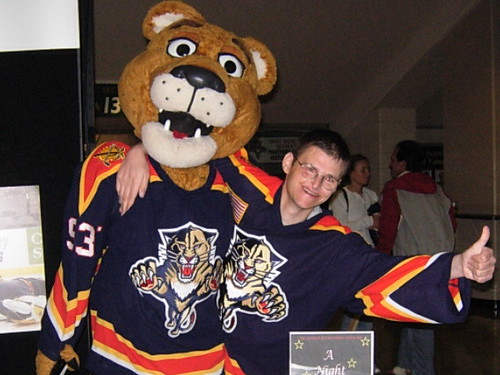
Stanley C. Panther representing the Florida Panthers
Coolness: 3
WTF Factor: 0
Mugshot: http://farm2.static.flickr.com/1222/1138631927_bd3dd9c0b9.jpg?v=0
Stanley’s cool, I have no real problems with him. But panthers are fierce creatures that hunt and kill their prey without mercy. Stanley must do this a lot before moonlighting as Panthers mascot because he looks very sleepy. Or stoned. Maybe he smokes a big fuzzy mascot blunt before each game. I really don’t know. Look, any time you incorporate eyelids onto a mascot, it’s going to look sleepy. It’s the fault of the designer, not Stanley. He loses points for his lack of fierceness and for his name because he is the only “Stanley C.” the Panthers will see in their building any time soon.
FACT: Stanley C. Panther is named for the Lester B. Pearson award, given to the NHL's outstanding player as selected by the members of the NHLPA.
Slapshot representing the Washington Ovechkins.
Coolness: 3
WTF Factor: 0
Mugshot: http://www.missva.com/2006/adrianna/images/feb04/capitaleagle.jpg
Slapshot has a +3 because he just doesn’t really impress me. Now I know what you’re thinking. You’ve looked at the picture of all the mascots, you see Slapshot sitting there on the stairs and you’re thinking “I think Slapshot deserves more than a 3. He’s a solid 4. No he’s not. Look at the other birds. Look at Thrash. Look at Wildwing. Now look at Slapshot. The other birds just set the bar too high. And if you’re concerned about Slapshot getting a 3, you’ll soon realize that a 3 is as good as a 5 once we start getting down to the 1’s, 0’s, and negatives.
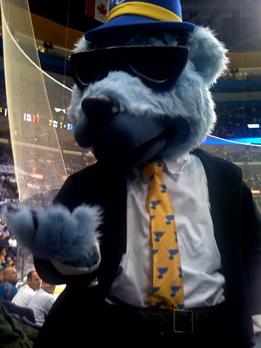
Louie representing the St. Louis Blues
Coolness: 2
WTF Factor: 1
Mugshot: http://farm3.static.flickr.com/2121/1733173642_8734418ca7.jpg?v=0
The blues are getting off kind of easy here. What do you want, a big, fuzzy musical note with eyes skating around? A big, fuzzy saxophone? Really? So the Blues kind of have the luxury of choosing any animal they want and just making it blue. And that’s exactly what they did. Louie is a blue bear wearing a little hat. I’ll be perfectly honest with you, this mascot should annoy me. It really should, but it doesn’t. I really can picture this thing playing a guitar or a saxophone or something. No kidding, he looks like a blues musician. Louie is pretty convincing in that regard, and looking at him doesn’t cause instant physical illness like some other mascots. I don’t have much of an opinion here; it’s a blue bear. He’s not that cool which is why he scores a 2 in coolness. But he loses one point from the WTF factor because he’s a bear and that has nothing to do with the St. Louis Blues. No matter what the Blues choose as their mascot, they’ll still get at least a 1 in WTF Factor. The name of the team is not conducive to having a mascot.
Sabretooth representing the Buffalo Sabres
Coolness: 4
WTF Factor: 3
Mugshot: http://www.sportable.com/wp-content/uploads/2007/04/sabretooth.jpg
He looks really cool, but sleepy and cartoony when compared with Gnash. My real problem with Sabretooth isn’t even his fault. He’s just an extinct cat that applied for a job and got hired. He’s alright. My problem is with the ongoing identity crisis the Sabres have had over the last 10 years. Let me break this down for you. The name of Buffalo’s team is the Sabres. A sabre, is a single edged sword with a curved blade. The team’s logo incorporated both the name of the city and the name of the team for years as it was a buffalo over two crossing sabres. But then they changed it to just a buffalo head. Then they changed it again to a mutant buffalo/slug thing, which is what it is today. Now… tell me… wtf… does a saber-toothed tiger have to do with the Buffalo Sabres? Yes, stop, I get it. SABRE-toothed tiger. STOP IT! It would be like if the Rangers made their mascot a pickup truck or if the Capitals made their mascot a giant, fuzzy uppercase letter. It’s a play on the word to get them a cooler mascot then they would have had and I’m not buying it. Buffalo teams have always been way more about the city than the team anyway. Even the Bills have a buffalo as their logo. Just do what you’ve wanted to do forever: Call both teams the Buffalo Buffalos and make the mascot a buffalo. It’s what you want. It’s what you really want.
S.J. Sharkie representing the San Jose Sharks
Coolness: 1
WTF Factor: 0
Mugshot: https://blogger.googleusercontent.com/img/b/R29vZ2xl/AVvXsEibMRGPnyDr5mV-od4i9HLhSorJSyjR9Ux4he3ca8lns9th68_X3_gR2HC8TjEuFnIMkHcvbl6dS7lCPI1YjRYyog54nxbihju28X38BGW8LgNWHWDxeFdEVDfZi5YzWuJGzct8E-mfkrU/s1600-h/800px-SJ_Sharkie.jpg
Who put the hockey skates on that T-Rex? And why? If you’re going to make a mascot based on an animal, it should maybe look like that animal. Sharkie’s head doesn’t resemble a shark at all; it looks like some kind of a down syndrome velociraptor. He gets points for accuracy because (technically) he is a shark… with legs… and fingers. Looks like Darwin was right because this is evolution at its finest. Sharkie must have used affirmative action to get his job. There had to have been other sharks (that breathe air, have arms, legs, hands, and no gills) that were just as qualified for the job of team mascot. But hire a shark with a mental handicap and it’s a P.R. dream come true.
OPINION: Pretty sure that’s just a guy in a suit cause sharks don’t have legs.
Stinger representing the Columbus Blue Jackets
Coolness: 3
WTF Factor: 3
Mugshot: http://www.sports-mascots.co.uk/COLUMBUSBLUEJACKETSSTINGER.jpg
This is really getting frustrating. I blame myself. Rich didn’t make me do this. He didn’t even ask me to do this. I consider my score of an even zero to be generous. Stinger is a yellow jacket. You know, those annoying little hornets that don’t pollinate, offer no benefit to the world and can sting repeatedly? Yeah, that’s what Stinger is. But he’s blue so he’s technically not a yellow jacket. Stinger is a… wait for it… Blue Jacket. Just like the team which has blue colored hornets all over their uniforms… … … … They don’t. I made that up. I wish I didn’t. The name Blue Jackets refers to the uniforms worm by the Continental Army during the Revolutionary War. Not a bug. So how… how did they come to that decision? Seriously, how? I almost demand to know. How cool would a mascot-representation of a revolutionary war soldier be? Infinitely cool! Give him a prop rifle that he can fire off when the team scores! But a blue hornet as your mascot?! Do you know what the name of the team is?! It’s the Blue Jackets! Not the Blue Jackets! What did you do, call Buffalo and ask for mascot suggestions?!
Iceburgh representing the Pittsburgh Penguins
Coolness: 0
WTF Factor: 0
Mugshot: http://cache.daylife.com/imageserve/096XgAJddqbQk/340x.jpg
This was a tough one for me. I like his name, it was already appropriate before incorporating the name of the city into it. He’s a penguin… just like the team. Can’t really knock anything there. He’s 100% accurate hence the zero WTF score. But terribly uncool hence zero coolness points. I’ll just say it: This is the mascot that the other mascots pick on. He should have a “kick me” sign on his back at all times. Look at his face! It’s like he’s constantly saying “Duhhh… hyurka hyurka hyurk… I’m a skatin’ I sure am…” At any given moment, Iceburgh looks like he has no idea where he is. Maybe he thinks he’s at a carnival, I don’t know. His eyes almost look like they’re going in two different directions. What can I say, he’s a big, cute, fuzzy penguin and there are far worse on this list than he.
FACT: The original Penguins mascot was a real Penguin. It’s habitat was kept too warm and it died, thus ending the use of real animals as NHL mascots.
Nordy representing The Minnesota Wild
Coolness: 0
WTF Factor: 1
Mugshot: ???????
At this point I have yet to see a picture of the actual Nordy. He’s brand new for the 2008/2009 season. The cartoon picture I did see would strike fear into the heart of… no one. It’s really the most timid looking rendition of a mascot I’ve ever seen. It’s downright happy to be there with a smile that rivals that of dumb Carlton the Bear. What were they thinking? You’ve got your mascot right there in the team name! The Wild! Why is it a teddy bear with a mullet in a hockey uniform? Nordy represents the team’s logo perfectly so I can’t complain too much on accuracy. But there are some cases where it’s ok to take a name and run with it, and some cases where it is not (Columbus). This would have been a great opportunity to have a truly Wild mascot. Nordy should have an evil grin and a leather jacket with spikes and a Mohawk. He’s WILD!!!!! I know, the name Wild refers to the wilderness, but as I said, this is a case where it’s ok to take a name and interpret it a little differently to make a cooler mascot. Nordy passes, but he could have been so much cooler.
Fin The Whale representing The Vancouver Canucks
Coolness: 1
WTF Factor: 2
Mugshot: http://audrasphotography.files.wordpress.com/2006/08/00860024_resize.jpeg
This is one that I fail to understand on so many levels. I don’t know where to start… How about with the fact that he’s a whale? I understand a killer whale is part of the Canuck’s logo but… why? There already was a team called the Whalers. They moved. It was sad. Let me define the word “Canuck” for you. Canuck is a word used by Canadian residents to define their nationality. A Canuck is a Canadian. Canadians… killer whales… Look, I have a very vivid imagination. Look at my fantasy picks 2 weeks ago if you need proof. I chose a line consisting of 3 inanimate objects and hotdog vendor backed by a garbage can in net. My imagination works just fine. But even my imagination cannot make a connection between the people of Canada and orcas. I know, I know… killer whales swim up north and can be found in the waters off the west coast of Canada, yes, I get it. But what’s the first animal that comes to mind when you think of Canada? Probably the moose, but that doesn’t matter cause it’s not a whale! It’s not a whale.
Fin also loses points due to the extreme case of retardation he seems to have. Mascots aren’t supposed to have cerebral palsy. A toothy grin and mouthful of tongue isn’t enough to make this puddinhead the worst mascot though.
FACT: Another fish with legs… pretty sure it’s just a guy in a suit again. I’ll get back to you.
FACT: Whales are mammals. It just sounded funny. Let it go.
Al The Octopus representing the Detroit Redwings
Coolness: 3
WTF Factor: 5
Mughsot: http://upload.wikimedia.org/wikipedia/commons/thumb/8/84/Al_the_Octopus.jpg/800px-Al_the_Octopus.jpg
Al? Now I have to write about a mascot named Al? The very fabric of my sanity is beginning to come apart. I want you to realize this and hopefully appreciate it. We all know about Dertoit and their strange octopus fetish. Especially during the playoffs. That being said, this mascot can only be seen during the playoffs. I debated whether to put him on this list for that reason along with the fact that he is not a costume. Al is just a big, pissed off octopus that gets lowered from the rafters. I’ll admit, he ain’t bad looking. In fact he looks mighty pissed off. His coolness rating is quite solid with a 3. The WTF factor is an easy 5. It should be like, a 20. I know the octopus is part of Red Wings tradition but it still doesn’t make an octopus have any relevance to the team name or logo. EVEN if they dress him in an 8 sleeved jersey… which they did.
Could you imagine if a team like the Islanders had a mascot that was only seen during the playoffs? No one would even know they have a mascot. Only a team like Detroit could get away with a playoffs-only mascot.
Sparky The Dragon representing the New York Islanders
Coolness: 3
WTF Factor: 5
Mugshot: http://farm3.static.flickr.com/2330/2273059789_3512a12035.jpg?v=0
What Sparky gains in cool looks, he loses two-fold in having nothing to do with the name of his team. Now I know with a name like the Islanders, there really isn’t much you can do in the way of a mascot. But that doesn’t mean pick whatever the hell you want and slap a jersey on it. It means don’t have a mascot! At least make the thing hockey related! A dragon? Wtf… Dragons are fierce, violent, intimidating, fire breathing, ruthless, creatures that do not exist. The Islanders do not share one single characteristic with dragons. If they had chosen a dung beetle as their mascot, I could at least say the two share the characteristic of existence. But we don’t even get that. Why not a big fuzzy ship captain? Make him look all salty and angry. If done right, it would look cool. But no, we get Sparky. Curious as to why the hell the Islanders would choose a dragon as their mascot, I decided to look into it and find an answer. The Islanders owner also owns an arena football team called the Dragons. He liked Sparky so much that he made him the mascot for both of his teams. Same dragon, different teams. What I gather from that is the following:
FACT: The Islanders owner likes his arena football team more than his NHL team. So do I.
Carlton The Bear representing the Toronto Maple Leafs
Coolness: 0
WTF Factor: 4
Mugshot: http://www.tmlfever.com/files/carlton_standing_2.gif
*Sigh* Don’t Toronto fans have enough to be upset about with this team? And they have to deal with this? Granted, I did draft Carlton for my fantasy team, but that doesn’t make him a good mascot. This is another one that begs the question… WHY? I know that a big maple leaf skating around would look silly, but really, would it be much sillier than Carlton? No. No it most certainly would not. I just don’t understand the trend of making your team mascot whatever the hell you want. Why an overweight polar bear? Why? Why not an in-shape polar bear? Why any polar bear?! Why not a beaver, moose, yak, Patrick Duffy or unicorn? How awesome would a tarantula be? So awesome! Give him 8 hockey sticks! No, we get a dumb bear with a passion for donuts. Ever see a real polar bear? They are ferocious creatures, the way they annihilate seals and penguins and stuff. Look at the group photo. Look at Carlton. Now look at Blades. See my point? I’m not scared of Carlton. I want to sit on his lap and tell him what I want for Christmas and then piss my pants on his leg. On how many levels must Toronto fail simultaneously? And there’s talk of an expansion team! A 2nd Toronto franchise. What would their mascot be? A (expletive deleted)ing giraffe? Why did I decide to write this list? It’s seriously damaging my sanity.
FACT: If I make it to the end of this, I am hoping for at the very least, some quiet applause. Fireworks would be lovely, but quiet applause is enough.
Thunderbug representing the Tampa Bay Lightening
Coolness: 0
WTF Factor: 4
Mugshot: http://nhl.speedera.net/intheslot/read/mascots/images/thunderbug226x338.jpg
Tampa fans: Your team is mocking you. They are. I’m sorry to be the one to tell you this. But my team doesn’t have a mascot, nor will they ever. Please, if the Rangers tried to have a mascot, New York fans would rip its head off and beat the crap out of the guy in the suit. That’s right, kids. Cry for me. Mascots are all just guys in suits! (Except for Al.)
Thunderbug is a… is a… is a bee I think. Yeah. He’s a bee. That’s right; Thunderbug is a bee representing his favorite team, the Tampa Bay Lightening. It’s like… what joke can I come up with here that would be funnier than the truth? Just look at the thing. It’s not even cool! If the team were called the Bees, this mascot would still suck! Real bees don’t want to be represented by this thing. Bees are a terrible animal to name a sports team after. You’re talking about an animal that’s good for one year and then it dies, what the hell kind of… Ohhhh so THAT’S why a bee is their mascot. Never mind, and 5 points for accuracy.
Spartacat representing the Ottawa Senators
Coolness: 0
WTF Factor: 4
Mugshot: http://nhl.speedera.net/intheslot/read/mascots/images/spartacat226x378.jpg
Spinning the wheel of random animal mascots and landing on “handicapable lion” is Spartacat; Mascot of the Ottawa Senators. What ancient Sparta and Ottawa have to do with each other, I will never know and don’t care to research. What a lion has to do with either, I will also never know. Did the Spartans feed people to lions? Maybe. Even if they did, what does this have to do with anything Canadian? Why do mascots have to be animals? A physical representation of the Senators logo would have been fine! It would have been more than fine; it would have been downright awesome! Give him a big, fuzzy sword to harass opposing players and fans with. It would be great! And it could be made to look cool. But no, we get a lion thing that looks like it should be collecting shopping carts in the parking lot at the supermarket. Further affecting his coolness score is the look on his face. He looks ferocious but happy? Like he doesn’t know whether to gleefully shake your hand or bite it off.
Stormy the Pig Representing the Carolina Hurricanes
Coolness: 0
WTF Factor: 5
Mugshot: http://digitalheadbutt.files.wordpress.com/2007/04/carolinahurricanes_stormy.jpg
So… the name of your team is the Hurricanes. Cool! Yes! Hurricanes are violent! YEAH! They destroy things! AWESOME! They’re rather horrifying! SURE ARE! Almost nothing can stand up to the might of a hurricane! NO CHANCE! Hurricanes are best represented by a pig! YEA… wait, what? Alright… this is really just a formality… but lets look at the score here. The coolness factor is a zero. Just look at Stormy. Tell me it’s not a zero. He doesn’t even look cool. If you’re going to make a pig your mascot, make it look fierce. A wild boar with huge teeth. But apparently making your mascot cool is a thing of the… never was. As for the WTF Factor, we have an easy 5. Look at the name of the team. Now look at Stormy. WTF. 5.
FACT: Stormy is a pig because of the abundance of pig farms in the Carolinas.
FACT: Stormy wears a number 97 jersey representing 1997; the year America’s beloved Hartford Whalers moved to North Carolina and shattered the dreams of every child, puppy, and unicorn in the entire world.
That’s great. Wear 97 to remind us all of the team we lost. Sure, they were terrible. But no team has ever deserved the label “Loveable losers” more than the Hartford Whalers. I can confidently say that the entire population of the entire world wants the Hartford Whalers back. Instead we all have to endure a pig wearing 97 to remind us of what we lost and of crying children, puppies, and unicorns. Do you hate Stormy yet? Good. Hold onto that hate cause we still have a few more to go and I swear you’re going to need it.
Youppi representing the Montreal Canadiens
Coolness: 0
WTF Factor: 5
Mugshot: http://i135.photobucket.com/albums/q124/cdnuniguy/Mascots/youppihabs.jpg
Alright! I’ve (expletive deleted)ing had it! Who designed this (expletive deleted)ing piece of (expletive deleted)?! What the (expletive deleted) is it? Some kind of (expletive deleted)ing fur monster?! It can’t be a (expletive deleted)ing man, look how (expletive deleted)ing furry it is! So then what the (expletive deleted) is it? Youppi is (expletive deleted)ing French for “Yippee,” or “ Hooray.” Anyone cheering for this piece of (expletive deleted) is seriously (expletive deleted)ed in the head. Or Canadian. Looking at this (expletive deleted)ing thing makes me flash white with rage and want to cause harm to the nearest living creature. Seriously, (expletive deleted)ing answer me, what is this piece of (expletive deleted)?! It looks like a man with a beard but it’s completely covered with (expletive deleted)ing orange fur! If you needed a reason to hate Canada, this is a perfectly good one. If I saw this thing, I’d (expletive deleted)ing choke it.
FACT: (expletive deleted)!!!!!!
Harvey the Hound
Coolness: -2467
WTF Factor: 462,827.5
Mugshot: http://farm3.static.flickr.com/2060/2087730371_48d513017e.jpg?v=0
Evidence: http://www.youtube.com/watch?v=ZWr9yECJfww
I have gone to great lengths to come to some kind of understanding regarding Harvey the Hound. I have failed. It’s taken me so long to get to this point; 3 weeks. And now that I’m here, I just want to kill myself. That’s right. I want to kill myself over a retarded dog in red shorts. Harvey’s image inspires pure self-loathing. It does. It makes me hate myself. Harvey the hound is the worst mascot in the history of all mascots. After all I’ve just put myself through, I really don’t need this. Not Harvey. Not now. Not ever.
Harvey fails on levels I not only didn’t know existed, but levels I didn’t know could be failed upon. He’s by far the dumbest thing I’ve ever seen. Let’s forget about mascots altogether for one second. Yes, this is the dumbest individual thing I have ever seen in my entire life.
FACT: Harvey the Hound was the very first NHL mascot, introduced in 1983.
Flames… you had a clean slate and this was the best you could come up with? You could have done anything you wanted! “LOL, let’s make him stupid.” Who approved this? Harvey is worse than Youppi. Worse by a mile. I would say that he makes other Mascots look good but I refuse to offer any kind of positive argument regarding Harvey the Hound. And nothing could make Youppi look better, not even Harvey.
To make matters worse, Harvey is also a complete jerk. He behaves far worse than any other mascot in the NHL, including the Jersey Devil. That’s right! Harvey the Hound: Worse than The Devil. I’m going to go on record right now and just come out and say it. I mean why dance around the issue any longer? I hate Harvey the Hound. That’s right. Hate. When I first saw his picture, I’ll admit; I laughed. I laughed a lot. I laughed until my sides hurt. But after a while, it just wasn’t funny anymore. Maybe the joke wore off. Maybe it was the slow and painful departure of my very soul. Either way, what once inspired laughter now inspires rage. And when I see that stupid tongue, it makes me feel sad. Sad as if there’s less happiness in the world with no hope of restoring it.
FACT: Harvey was so successful after his debut that other teams contacted his creator, Glenn Street, to design mascots for them.
FACT: Harvey is consistently voted “Most Popular Mascot” by the fans.
Are we talking about the same mascot here? We can’t be! This mascot sucks so bad it causes mental anguish. How could anyone see this thing and think “I need my own one of those!”? How could anyone look at this thing and think “This is the best mascot I’ve ever seen! I’m voting for Harvey!”? How… why… did the Flames make this their mascot? It has nothing to do with the team! I’m not saying we shouldn’t try this; But setting it on fire and thus incorporating flames into the costume would still not make him relevant to the name of the team. Speaking of not being relevant to the team, here’s one that will piss you right off:
FACT: Harvey is the ONLY mascot in the entire league that does not wear his team’s jersey. This also makes him the only mascot to not even have the team’s name or logo anywhere on himself. Even Al the Octopus has an 8 sleeved Redwings jersey.
It absolutely blows me away that Harvey was the first. The open door, the inspiration for future NHL mascots. How can this be? And you’d think that there would be a significant improvement among NHL mascots with Harvey as their starting point, but no. Look at Youppi. Look at Fin. It’s obvious that someone in Vancouver saw Harvey and said “Gimme that, but make it a whale.” With Harvey as a starting point, I have a right to expect that 25 years later, at least one team’s mascot would have evolved into a diamond. A real diamond worth millions of dollars. But no, there hasn’t been much evolution here. The stupidity has moved mostly laterally with only minimal forward motion.
I want to take this opportunity to thank Craig MacTavish. While coaching the Edmonton Oilers a few years back, he lost patience with Harvey who was taunting him from behind the visitors bench. MacTavish responded by ripping Harvey’s tongue off.
(Editor's Note: http://www.cbc.ca/gfx/topstory/sports/harvey_mactavish0321.jpg)
I know I should seem more excited to report this, but you must understand the following: After what I’ve just put myself through, I’m not laughing at anything. I would need a case of beer, a bottle of rum, a woman of questionable morals, and a winning lottery ticket just for my temperament to break even. Then I could muster a smile at stupid Harvey’s tongue being ripped off. I hate Harvey the hound. 12 Youppis are not worth 1 Harvey the Hound. If the name of the team was The Calgary Palsy Dogs and Harvey was the mascot, I would still hate him.
3 weeks. That’s how much of my life I’ll not get back as a result of this nonsense. I know things about NHL mascots I didn’t want to know. I know all of their names. 3 weeks ago I was pointing to different mascots in the group photo saying “LOL what the hell is that thing?” I now know that it was Spartacat. I’m sad that I know its name. I wish there was something positive we could all take away from this, but it’s not possible. Just looking at Iceburgh will lower your IQ, so don’t try. It’s not worth trying to scrape up a positive out of this. There’s nothing to be gained from the experience. I just keep slurring to myself “It’s Blue Jackets, not blue jackets!” as I take another swig out of an emptying whiskey bottle.
Good or bad, mascots don’t effect the team, so don’t be afraid if yours has one. Your team will win or lose on their own. Sparky can’t make the Islanders win (nor could a full freight container labeled: TALENT), and Thunderbug won’t lose any games for the Lightning. They don’t need the help this year anyway. Mascots don’t have to be lame, but as long as Harvey, Youppi, Carlton, and Stormy remain in service, the Mascot average is dragged down far enough that it’s ruined for the good mascots.
Final comments on the group photo:
- The NJ Devil’s body language clearly shows that he doesn’t want to sit next to Spartacat.
- Fin sitting next to Iceburgh looks like brothers separated at birth.
- Every mascot wears his team’s home jersey with Fin and Howler being the only exceptions wearing away jerseys. Harvey sucks and doesn’t wear any jersey.
- With the exception of the NJ Devil, the entire top row consists of mascots with mental disabilities.
Take away from this what you will, for better or for worse. I’ll be back next week with something that hopefully isn’t as emotionally damaging. Until then, I will wait and listen for the sound of polite applause. Or fireworks. Whatever you’ve got is fine.

